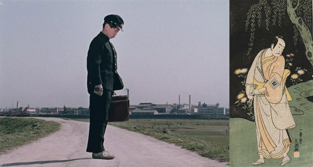
Sex, drugs and Kabuki. Haunting desperation, revenge and regret in Noh. These two styles of Japanese theatre couldn’t be more removed from each other. The former hinges on excess, excitement and exaggeration, the latter is more reserved, depicting the stories of those once alive, their ghosts now haunting the stage to tell tales of the lives once lived, these lives usually exuding dramatic tragedy. Kabuki was full of scandal. In its inception, most actors were female, and often prostitutes. The plays were normally performed within red-light districts and hinged on themes of sex and excitement. There was sensual dancing. There was loud, expressive singing. The upper classes and lower classes mixed in the crowd, supposedly the only setting in feudal Japan in which they did so. The Japanese government attempted ban this form of theatre for being too erotic on multiple occasions but to little avail. Nobody could stop kabuki. The horny Japanese audience found all sorts of ways around the law to get their theatre fix. Noh was the choice of theatre for snobby, entitled, elitist arseholes. No scandalous actors, no sex appeal, no dancing, no exaggerated expression. Noh centred around a posh man wearing a mask, pretending to be dead, woefully crooning about his shitty life. It’s hard being a member of the upper class, with all that money and privilege, isn’t it? The actor would slowly, very slowly, move about the stage, giving his account of what led him to his death. Musicians would provide a very minimal soundtrack to his story, occasionally letting out little yelps in response to the dead man’s musings. Although drastically different, both types of theatre are now considered forms of traditional Japanese art. Yasujirō Ozu, a lauded Japanese film director, took aesthetic inspiration not only from both these forms of theatre but from Edo and Meiji-era Japanese woodblock prints too. His movies are beautiful. Every scene looks like it has a flat back-drop—just like Kabuki and Noh theatre—and uses the isometric perspective of woodblock prints.
In Western film, TV and art, perspectives lead into the infinite; the viewer’s eyes are led to an infinite point on which to focus their attention. Within Japanese woodblock prints, there is no infinite. The perspective is instead, as mentioned above, isometric, inviting the viewer to inspect every detail along these isometric lines, with a flat background behind the subjects of interest, to which no lines of perspective definitively lead.
Yasujirō Ozu creates the exact same isometric lines of perspective within his movies. He defied the conventions of the dominant Western film industry, instead developing and building upon the art that had defined Japanese aesthetics for hundreds of years. Not only did Ozu defy conventions in terms of perspective but in terms of directing techniques too. Ozu rarely moves the camera. Most scenes (in fact, almost all) feature a static camera, unmoving and unmovable, usually shooting from the same height that one would be whilst kneeling on a tatami mat. This gives his movies an air of great intimacy, as the viewer feels that they are personally observing the proceedings, as if they themselves are knelt on the tatami mat, there in the room with the actors on-screen. This intimacy is taken one step further with yet another break from the conventions of film. Within film, it is regarded as a great taboo to have your subjects look into the camera and it is an even greater taboo to have them talk into the camera. Ozu is known for utilising this forbidden technique, and to great effect: a young boy tells his mum about shitting himself and asks for new pants, his mum says not until he has learned to stop shitting his pants. Both subjects stare intently into the camera as they speak, the forlorn expression on this young boy’s face cuts through the colourful, creative malarkey of the surrounding cinematography, and his mother’s lack of empathy or remorse leaves a nasty, fucked-up sensation despite the beauty of the set behind and around her. This happens in Ozu’s movie Good Morning. Good morning, indeed.
I’m drunk; I’m pissed. I feel like I need to be, to write this goddamned article. Now, considering that second-to-last sentence, semi-colon notwithstanding, “I’m pissed” could mean a few different things. It’s all a matter of perspective. Speaking of perspective, it’s not the only thing that Ozu flagrantly stole from ukiyo-e (the Japanese word for woodblock prints). I’m not sure whether to explain with words the flawless mimicry with which Ozu appropriated ukiyo-e, or whether to simply show you. But before I make up my mind, I want you to know that Ozu didn’t just copy these beautiful, sublime, absolutely stunning works of art. He brought them forth from centuries past and presented them in evolved forms, adapting what was traditionally Japanese into a new medium—film. He took what inspired him artistically and emotionally and developed it to fit into what was current, keeping his traditions alive whilst adopting them into modernity. I’ve decided I’ll show you.
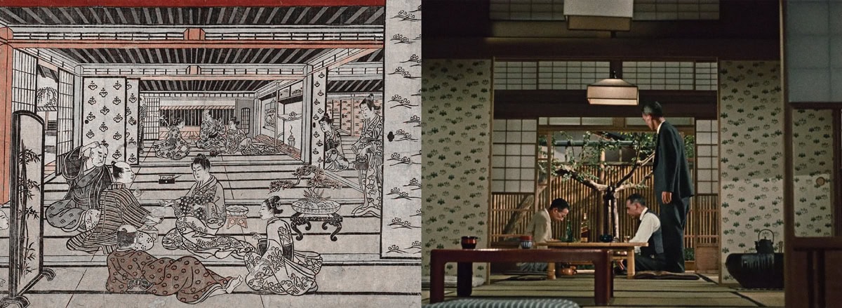
Fig. 1
新吉原座敷けんずもふ (A Game of Hand Sumo in the New Yoshiwara), Furuyama Moromasa, ca. 1740. This is a woodblock print from the Edo period. A group of men sit around a table playing hand sumo, a popular game from the time period. Behind them are sliding doors after sliding doors, creating frames within frames.
秋刀魚の味 (An Autumn Afternoon), Yasujirō Ozu, 1962. From Ozu’s last movie, this scene depicts a group of men playing go, a popular table-top game in Japan. Behind them are, you guessed it, sliding doors after sliding doors, creating (again, you guessed it) frames within frames. Ozu utilises this whole ‘frames-within-frames’ thing very often. He usually alters the lighting between each individual frame, darkening those that he doesn’t want the audience to focus on, and making brightest where he wants their attention the most.
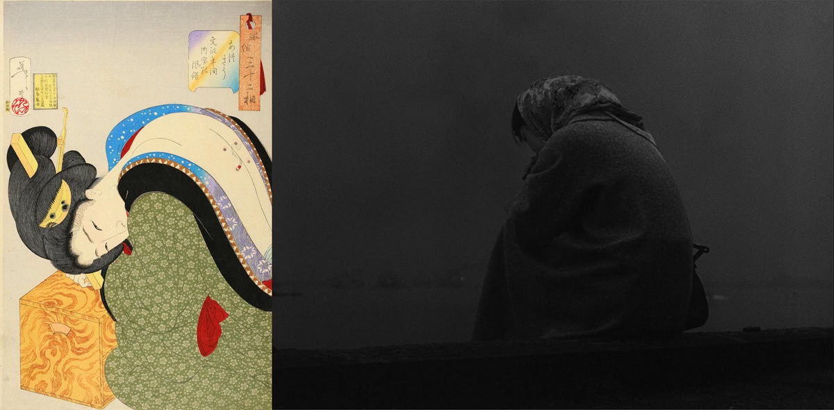
Fig. 2
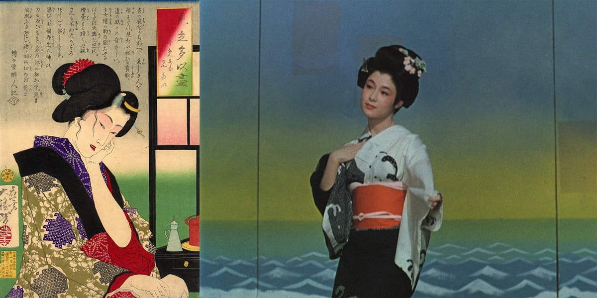
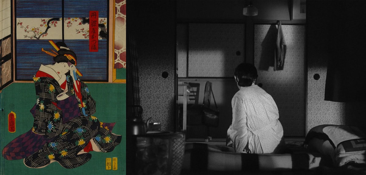
あつそう: 文政年間内室の風俗 (Looking Hot: The Customs of a Housewife of the Bunsei Era), Tsukioka Yoshitoshi, 1888. Created by the man considered to be the last master of ukiyo-e, this print features a cheeky-looking lady from the Meiji era receiving a session of moxibustion (you know that weird heat-treatment thing where people get other people to place burning-hot cups and the like on their back? That’s moxibustion). It was part of a series of thirty-two prints chronologically chronicling women (perv) from the Kansei era (1789-1800) to the Meiji era (1860-1912), all of different backgrounds and occupations, with each print and lady depicting a specific mood or character trait.
東京暮色 (Tokyo Twilight), Yasujirō Ozu, 1957. Despite depicting a very juxtaposed emotion, and the fact that the subject is looking the other way in comparison to Tsukioka Yoshitoshi’s woodblock print, the similarities are startling. It feels as if Ozu has taken the print, twisted it, contorted and moulded it to satisfy his creative needs and vision for this scene in his darkest movie.
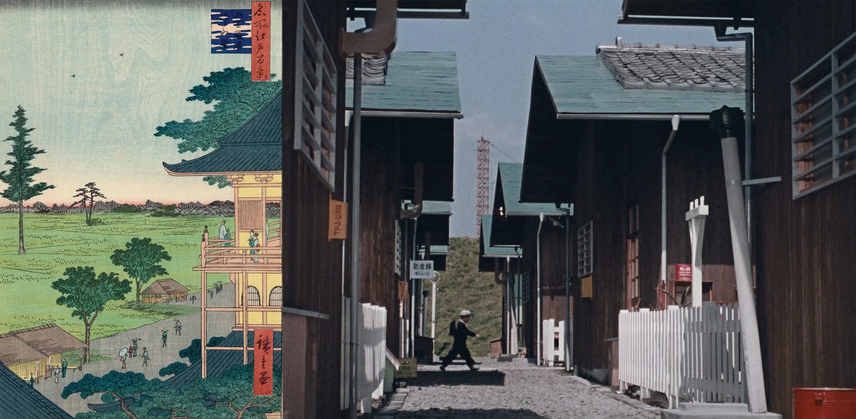
Fig. 3
ポートアーサーでの海戦 (Naval Battle at Port Arthur), Utagawa Kunimasa V, 1904. This print depicts an attack by the Japanese against Russian warships. A Japanese torpedo boat has struck (with torpedoes, obviously) three Russian ships: Russia’s two largest battleships at the time, the Tsesarevich and Retvizan, and a cruiser named Pallada.
東京暮色 (Tokyo Twilight), Yasujirō Ozu, 1957. Akiko, the same Tokyo Twilight protagonist mentioned above, disconsolately looks out to sea after her realisation of lost love. This shot is a P.O.V. (not like that, you dirty bastard). The similarities to this shot and Naval Battle at Port Arthur are startling and considering the subject matter—how love can feel like war—the similarities seem ultimately fitting.
Fig. 4
名所江戸百景 五百羅漢さゞゐ堂【復刻版】(100 Famous Views of Edo / Spiral Hall, Five Hundred Rakan Temple) Utagawa Hiroshige I, 1857. This piece is part of the most popular, best-known and most reproduced series of woodblock prints. It depicts a balcony famous for its panoramic view of the delta area in Edo-period Japan.
お早よう (Good Morning), Yasujirō Ozu, 1959. The perspective of Utagawa Hiroshige’s print seems to have been replicated in this scene. This exact same shot is revisited many times in Good Morning.
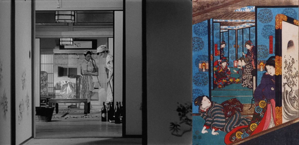
Fig. 5
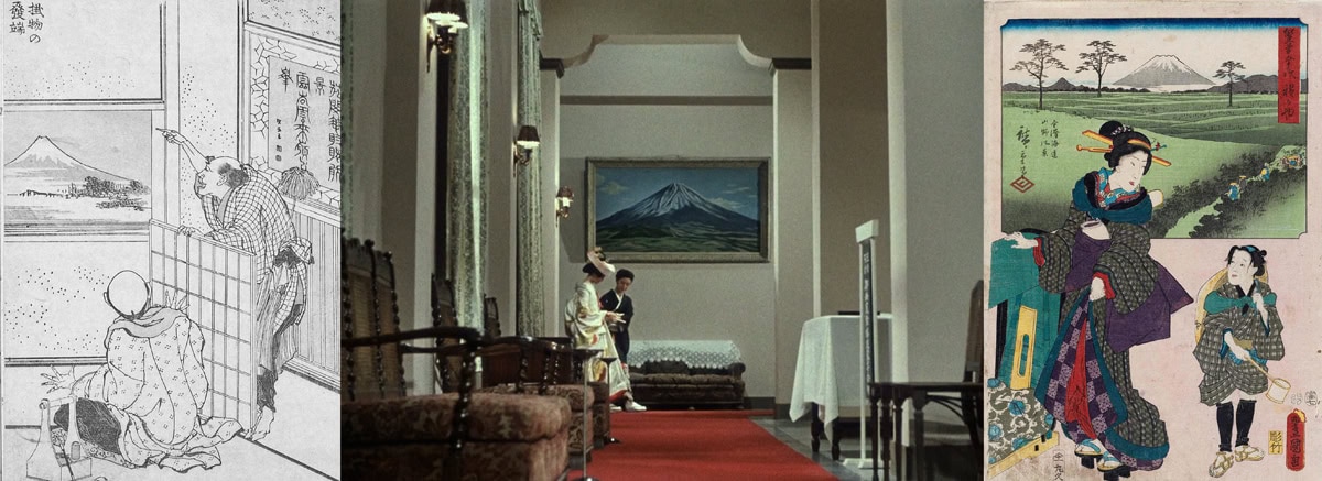
「本蔵妻戸無瀬」「娘小浪」(‟Honzo Tsuma Tonase” ‟Daughter Konami”), Utagawa Kuniyoshi, 1847. Although created by one of the last great masters of ukiyo-e, ironically the background and meaning behind this print was impossible to find, but just look at those frames-within-frames. Beautiful.
東京物語 (Tokyo Story), Yasujirō Ozu, 1953. This shot is of two maids cleaning a hotel in Atami. It features the same frames-within-frames as already discussed, and appears to draw great inspiration from Kumiyoshi’s work, looking almost identical. I’ll let a random soul from the internet add a little more information: “[Speaking of the events after this image,] the scene then cuts back to a shot inside a different part of the hotel, showing the maids continuing to clean. Once again viewed from a low angle, this shot demonstrates another of the film’s recurring visual motifs: frames within frames. Ozu uses sets of Japanese sliding doors to frame the two characters, using gradually more high-key lighting on each set in order to draw the audience’s attention towards them. Despite the film’s decidedly anti-theatrical style, the doors are shown to resemble a type of proscenium, raising the idea that the audience is in fact viewing a type of theatre: a theatre of everyday life. Throughout his filmography, Ozu shows an affinity for demonstrating the beauty of the mundane; the drama in universal situations that every audience member would be able to relate to. By framing this short, seemingly unrelated cutaway in this style, he is inviting the audience to view it as an emulation of real life, as if eavesdropping on a private conversation. As the maids clean, they talk about a pair of newlyweds who had stayed at the hotel the previous night. The couple is never shown in the film, and their exclusion is not atypical of the film’s style. Just as ellipsis was used to bridge the time between the couple’s sleepless night and the morning, it is used again here because Ozu understands that the maids’ conversation is enough for the audience to comprehend the events being discussed, a choice that is perfectly in tune with the film’s minimalist style (the relegating of seemingly important scenes to off-screen action occurs several times throughout the film). While their discussion is, at face value, completely unrelated to the film’s plot, this is once again an example of the film’s exploration of the mundane aspects of the world. Sex is a universal component of life, as universal as children growing distant from their parents, or as the sun rising every morning.” (https://www.reddit.com/r/TrueFilm/comments/bc7uhh/analysis_of_atami_scene_in_ozus_tokyo_story_1953/). There are five more images in this article, I know, but they speak for themselves and I’m running out of time to submit, so you’ll just have to use your own eyes to see the similarities between the art and Ozu’s work, which are glaringly obvious. Ozu’s films brim with a proud admiration of the artists that came before him. Just as modern masters of film emulate their heroes (Martin Scorsese mimics Akira Kurosawa, Quintin Tarantino copies a number of directors whom he admires), Ozu has done the same, paying homage to and emulating the artists and styles of theatre that inspired him. All the while, attempting to advance the traditional artistic rules to fit in with a new era. Seasoned author and researcher of film and directors, Donald Richie, once stated in his analytical book Ozu, that Ozu created his scenes with no meanings in mind. He says the direction and set up of mise-enscene in Ozu’s movies were intended to be purely aesthetically pleasing, and nothing more. No subliminal meanings, only beauty. This is not true; it is absolute, complete and utter bullshit. And I’m not the only one who thinks so. Have you ever watched The Cinema Cartography? It’s a YouTube channel, one of my favourites. They analyse and discuss film from all eras, spanning all genres.
Ozu takes centre stage in a few of their videos. And they agree with me. Ozu’s direction is rife with meaning: the telling of a story with no dialogue but through the placement of characters, through blocking, through the manipulation of gaze using leading lines.
This article is starting to feel a little drab, I wish I had more drama to write about. But there’s barely anything; Ozu was a very good boy. He lived with his mother until his death at the age of sixty. I wish there were some dirty scandal, something exciting to comment on and gossip over: some drug addiction that fuelled his creativity; some sexual deviancy that led to a tabloid circus; wild behaviour, violence or the like. But apart from an unconfirmed, speculative affair he might have had with one of his regular actresses, Setsuko Hara, there’s nothing. He was a very, very good boy. Apart from his films, he seemed like quite the boring man. I think his movies reflect this. Although very visually stunning, nothing much happens in them aside from some light family drama, or the innocent escapades of young school boys. In rare instances, the drama is taken to higher levels, such as in post-war drama Tokyo Twilight, Ozu’s seminal film, considered to be his masterpiece, in which protagonist Akiko has an abortion after being led to believe her boyfriend doesn’t love her, shortly before she’s hit by a train and dies soon after. But this heightened level of drama is rare in Ozu’s work. His films normally feel very safe and snug, like being curled up in a warm, cosy blanket on a comfortable, soft sofa, watching repeats of a familiar favourite TV show. When most other directors were trying to wow audiences with spectacle and action, Ozu chose to ignore the trend, and make movies based on what he knew: the mundane, the average life of a family, the charming dramas of boys on the cusp of manhood, the interactions between friends in a bar and the like. In a way, this makes him very ‘punk’. Which is ironic, as the man most definitely was not punk in terms of how he lived his life. But clearly, his denials of conventions nod to a man that didn’t care about popularity.
Ozu filters his work through his own lens to include his own life, interests and experiences and to create an extension of his own traditions, attempting to create a new branch of these traditions within the then-relatively-new Japanese film industry, in directing so rigidly, not conforming to changing styles and keeping to all these rules that appear to replicate previous, traditional pieces of Japanese theatre and art. That was a very long sentence, too long. I’m sorry. I was drunk before but now I’m really drunk. You’ll have to forgive me, or not. The choice is yours. I don’t care. Just like Ozu.
BIOGRAPHICAL NOTES
ALEXZANDER TURNER (1993) is a content writer, screen- writer, artist, musician and student studying for a BA in Creative and Professional Writing. A well-established mu- sician, having attended The Institute of Contemporary Music Performance and played at popular music festivals and prestigious venues. Has previously worked as content writer and creator for various brands. A fresh face to the freelance writing scene, he has begun writing screenplays, most recently for Ami Paris’s short promotional film The Great Escape, and articles for various publications.
ELENA PETITTI DI RORETO studied Media Design and received her BA and MA at the New Academy of Fine Arts in Milan, and then Film Studies at the Pratt Institute in New York where she was nominated for the Pratt Institute’s Presi- dential List. Elena went on to study Creative Direction for Fashion at the London College of Fashion. Elena started work as an editor at Collateral Films, a Milan-based production company and became Art Director after a year. One year later, she moved on to become a freelance Art Director and Director. Taking inspiration from art and photography, her films are characterised by a strong attention to aesthetics: details, light and composition. Thanks to her editing experience, she is able to build layered imaginative narratives. Working as an Art Director gave her the experience to deal with different types of media, making it easier to work alongside the client and incorporate enhanced methods to promote their content. Based in Milan and London, she has worked with several fashion brands and magazines including Bottega Veneta, Mulberry, Valentino, Dries van Noten, Cos, Hugo Boss, Vogue Italia and iD.
