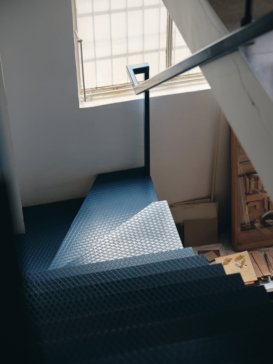
Fabio Calvi and Paolo Brambilla have worked together since 2006, concentrating their activity on interiors, exhibitions and product design. Following the example of the great masters of Italian design, they work at different scales giving life to projects permeated by a subtle irony although based on solid functionality. Here they tell Agnese Torres about themselves, going into the details of their latest collection Super. The design of the knob that distinguishes Super draws from a study based on the geometric figure of the super circle (or squircle), which combines the properties of a square with those of a circle.
Agnese Torres: Calvi Brambilla Studio moves fluidly between design and architecture working on different scales. What are the challenges and most fascinating aspects of these two design approaches?
Calvi Brambilla: In a way, we are part of the old school: we move according to the principle that the design method, once learnt, is applied to different scales, from the spoon to the city, to use the slogan created by Ernesto Nathan Rogers. After all, great masters of Italian design such as Magistretti or Zanuso were perfectly capable of handling different scales with enviable ease. Although we do not pretend to compare ourselves to these great authors, the Milan Politecnico where we trained followed this commandment and it is natural for us to work on projects both large and small.
AT: Yours is a four-handed work based precisely on the duality of vision and approach. How would you define your collaboration of no less than twenty years?
CB: We are often asked what is the secret to maintaining a working and personal relationship that has lasted so long: I would say that we are two complementary personalities; therefore, each of us makes a different contribution to the project. Moreover, being two means forcing the other to always give the best of himself. After all, we believe a lot in teamwork, and so we decided to establish Calvi Brambilla and Partners in order to have the contribution of younger professionals who also collaborate with us while maintaining a certain creative freshness.
AT: How and when did you start working with QuadroDesign?
CB: We started with a request from Enrico Magistro to design their booth for the Milan Salone del Mobile back in 2022: since then a relationship based on mutual respect was born, strongly motivated by a love of good design. In today’s context, QuadroDesign is one of the very rare realities moved by the desire to experiment and interpret the spirit of our time: the ideal client for a designer.
AT: QuadroDesign is a company that puts water at the centre, the protagonist and starting point of each of its projects. How do you relate to this element, what does it mean to you?
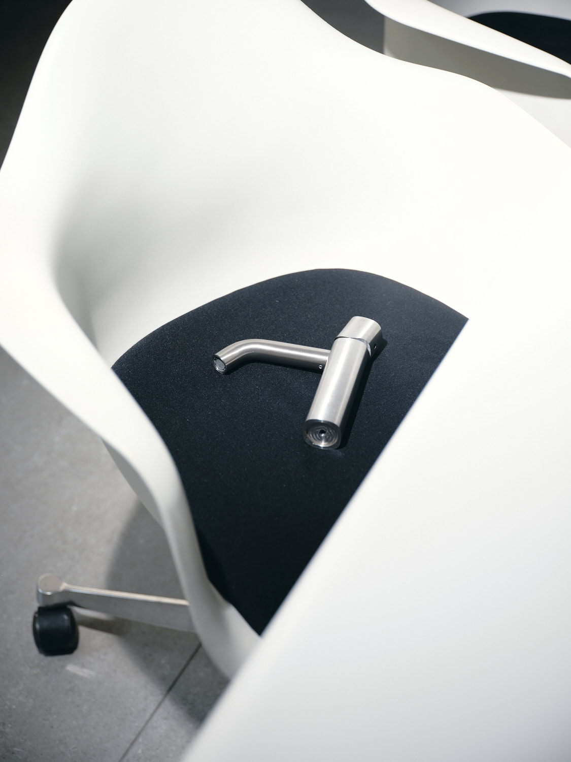
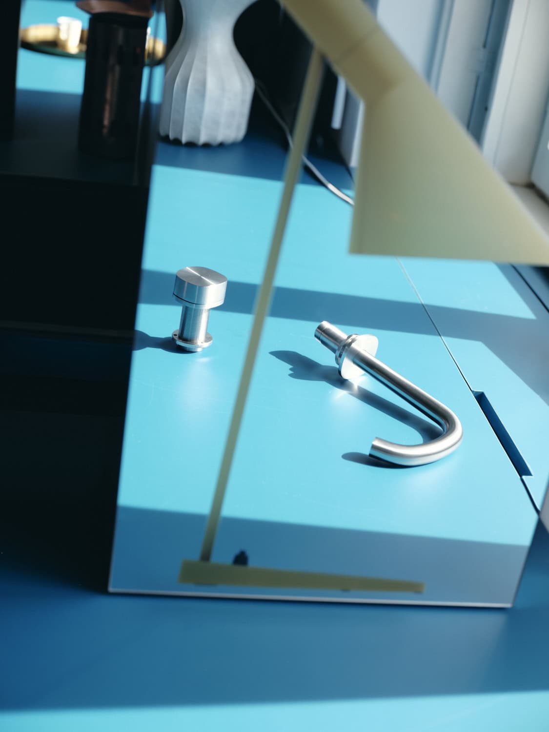
CB: Water is at the centre of many religions and philosophical systems: it is clear to everyone the symbolic meaning attributed to it, regardless of the culture it comes from. For a designer, therefore, designing with water means moving with the attention due to an essential element. Stainless steel, the noble material that perhaps most of all represents modernity, is particularly suited to enhancing the preciousness of water.
AT: In an interior design project, how important are spaces such as the kitchen or bathroom that must be able to combine practicality and aesthetics?
CB: There is no good design that does not know how to combine functionality and aesthetics, even if, because of the sacredness we attribute to water and the ritual of washing, the symbolic aspect guides interior design. Designing a bathroom, that is, a special environment where one gets undressed and takes care of one’s body, requires the designer’s capacity for identification and attention to detail. Similarly, the act of cooking can be said to be so charged with meaning that, from our point of view, it requires a special space that goes beyond pure functionality.
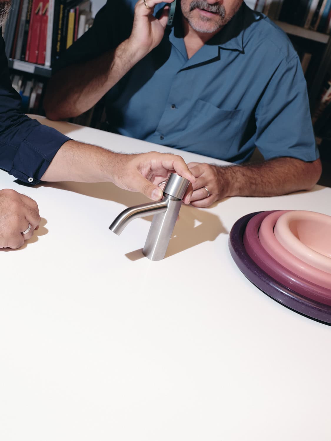
AT: Your latest collection Super is inspired by the geometric figure of the squircle, which is adapted in the handle and in the other elements that characterise the entire bathroom range. What motivated you to choose this shape?
CB: We started with the search for a shape that would allow the knob to be easily gripped with the hand, hence an ergonomic design, but that would not look like an object simply drawn according to its function. The squircle is a geometric figure that we love because it looks like it was drawn freehand but is governed by a mathematical function: not surprisingly, it is a shape that is widely used in the design of physical interfaces such as keyboards.
AT: What were the main aesthetic and functional challenges?
CB: Stainless steel is an extraordinary material in terms of its durability and appearance, but it poses many technical limits in the creation of free forms. In designing Super, therefore, we started precisely from an analysis of the technical constraints in order to delimit the field of action within which we could move. Once we had identified the squircle as a design and a figure, we adapted the theme in all variants necessary to build a coherent family. The minimalism and aesthetic cleanliness that characterises QuadroDesign products also had to be reflected in our series and so there was a long process of refining the details conducted side by side with the technical department.
AT: What are the advantages of working with a company that is so attentive to sustainability and able to enhance the human factor, while always keeping its eye on innovation and the future?
CB: We can say without fear of contradiction that the effort QuadroDesign makes every day to reduce its environmental impact is driven by a sincere feeling and not by a trivial marketing move. For us, as designers, it is a source of great satisfaction to work with a brand that is aligned with contemporary sensibilities in both image and content.